Like many of us1, I partake in the social ritual of daily puzzle games. Some of my favourites of these are lesser known gems such as The Daily Spell2, Clues by Sam, and Bracket City3, but my first love was NYT's Connections (sorry Wordle fans4).
Now, Connections is a flawed game5, and yet I find myself inexorably drawn back to it each day (even if only as one item in the sequence of other puzzles in the binge). Perhaps it's the thrill of cracking Purple first, or perhaps it's telling myself that I should just do it to try and do something potentially edifying with my last few minutes of the day, or perhaps it's just to spite whatever outlandish and/or unguessable groups it no doubt has to present that day6.
So, what does one do while staring at a puzzle, other than think about meta-gaming it? Anyone who has played Connections enough times will have noticed certain patterns in the starting grid — the first (top-left) cell is never yellow, there never seems to be a full row of a single colour, heck, there's barely ever even two words from the same group adjacent to each other! Given that, I thought it would be interesting to have a dig into the actual data and see whether there was any backing to these intuitions, or if it is actually entirely randomly distributed, and it's all just biases at play and I'm suffering from apophenia.
At the time of writing, there has been 1111 puzzles7 spanning over the course of nearly 3 years — plenty enough data to make some fun visualisations out of!
Let's dig in.
If you don't care about the journey, you can skip to:
To visualise data, one must first have data. Fortunately doing things with it is fine once you have it, because possession is 9/10ths of the law — unfortunately that means that one must first have it to be allowed to use it.
I did some quick googling, and (unsurprisingly), the NYT do not publish an immediately accessible public archive of past puzzles. Further investigation turned up a very helpful listing on Kaggle by Eric Nunes, which included all puzzles up to mid-December (of 2025) in CSV.
So I opened up a Kaggle account8, downloaded the data, and was off to the races.
This got me through basically the entire application's development, but towards the end I started craving more data, and the concept of having it automatically update its backing data appealed, so I spun up my own data source9 using a GitHub Actions workflow to automatically fetch and process the latest puzzle each day. I then hotlinked the raw blob from GH as the default data source for the webpage, so at any given point the page should have all data to within a day. Neat!
Of course, there's the risk that GitHub takes a dim view to me doing this, but I don't expect more than myself and maybe a few friends to actually use the site, so I doubt they will.
I'm not a big fan of the Cult of NodeJS10, and prefer hand-written11 static websites for their minimal bloat (and hence fetch speed), simplicity to deploy, and low cognitive load to reason about and implement.
Given this, I decided to try and implement this using vanilla JS, basic HTML and CSS, and as few libraries as I could get away with.
This turned out to be one solitary lib: D3.js
I wasn't keen to try and make my own graphs — this is a fairly well covered domain, and I'd been wanting to play around with several parts of D3 directly for a while, so it made sense to pull it in.
From there it's just a case of deploying and hosting the site. One self-hosted GitHub Actions runner later12, and I can push code to the remote, and have my VPS automatically pull and copy the static files to where my reverse proxy can serve it.
I started off with a few sparse ideas for graphs, and expanded and added from there. My initial drive was to make the graph that now sits at the top of the page — "which colour is a cell most likely to be?", and everything else was pretty organically grown from there.
I tried several other graphs that didn't make the cut, because they either didn't make sense, were overly pretentious, or just didn't show anything useful. One particular example is that for quite a while, I included a word cloud showing the most used words in the corpus (first instead of, and then alongside the word frequency bar chart). I eventually opted to remove it for various reasons (including because word clouds are a biasing display format14 for similar, but distinct, reasons to pie charts), but I struggled to remove it for the longest time (mainly thanks to our good old friend, sunk cost fallacy), but the word graph is more expressive in just about every way, apart from giving you that 'so smort' feeling while you look at it.
It also plagued the site with slow renders due to the cloud re-flowing step, which didn't add to its case, since D3 doesn't natively support word clouds, so rendering them required pulling in a third-party extension for D3 as well.
Cute, but difficult to parse.
A few more displays I kept as optional by-product graphs, locked behind view toggles floated to the right of their section header to avoid polluting the main view. For example, the tetromino chart — mainly because they're kinda cute and interesting, but aren't actually meaningful enough to show by default. There's all of four of them, and they occur in ~1% of puzzles, combined.
The group explorer initially just displayed the coordinates upon loading, which looks a little like a chart that just hasn't loaded in correctly:
Not great UX, eh?
Solution: randomly select one of the cells at page load to seed the diagram with something before a user looks at it. They can deselect it if they really want a blank board, but at least it's obvious that it works.
Second UX improvement: tweak it so that the board previews the result of selecting a cell during hover, rather than waiting for a fully committed click to add it to the current set. This makes it obvious that it's interactable while skimming past it, and simplifies a use-case I found myself using this chart for — making a one or two selections, and then seeing how the immediately surrounding cells impact the result set.
Performance. Can't live with (optimising) it, can't live without it15.
It's not too bad?
Yes, it could be a lot faster, but it can scrub through the date range (manually or with the timelapse feature) performing constant re-renderings without any noticeable lag on both my mid-range PC and smartphone, which is really all I was aiming for.
There were a few hiccups along the way, however. The aforementioned word-cloud was a major offender in this department, and I had to not only move its word filtering/stemming and render reflowing steps to a background web-worker, but also debounce the graph render to prevent it consuming too much main thread time, causing the entire page to lag.
The physics simulation inside the bubble charts is kinda neat — I wanted to experiment with the kind of physics-enabled graph editors like Obsidian and Memgraph Labs expose, and this was my outlet for that. It's relatively low-cost, but there was both noticeable CPU usage at rest, and a visible jitter as the simulation continued conjuring motion out of what should have been a stable state. Instead of burning too much time tuning it, I just configured it to hibernate the sim when the motion dropped below a certain threshold.
Otherwise, most performance gains came from basic strategies like memoising calculations where possible, avoiding unnecessary redraws, and caching reusable results.
So, what have I learned? (about Connections, not from building the webpage — that was pretty straightforward)
Firstly, a warning — this is not rigorous statistical analysis, it's very much a layman-level look at what's going on.
Also... none of this matters as soon as you get your first group anyway, because they shuffle afterwards, so we might as well just have fun here.
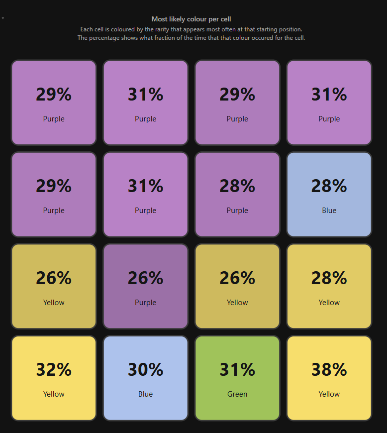
Our first graph, pinned at the top of the page, because it's the most shiny in terms of raw "oh, that makes so much sense!".
Look at it! Behold!
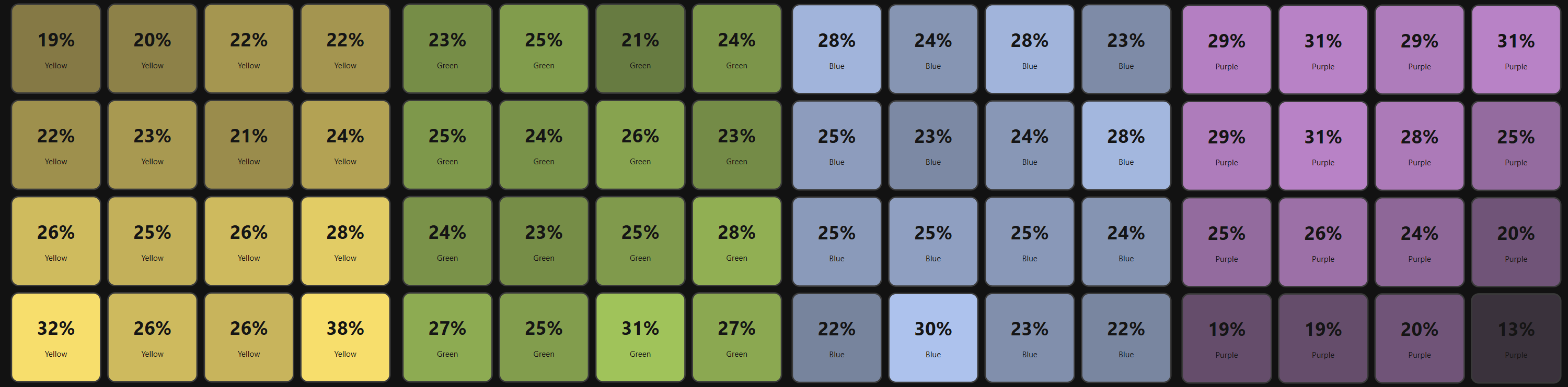
Here it is again, but this time split by colour, instead of overlaid (in the above, highest average wins):
Some things immediately jump out at me:
the top two rows are dominated by purple (at time of publication)
by the time you get to the bottom row, purple has no staying power left
oh boy, that bottom right corner? Basically never purple. Good to know!
Speaking of the bottom right corner, yellow loves to hang out there.
his pals are the other outer edges in the bottom two rows - often yellow as well.
Bear in mind that the 'average' for any cell/colour combo will be 25%, and the aggregate standard deviation is 3.79 pp (percentage points). By colours:
Yellow: 4.6 pp
Green: 2.2 pp
Blue: 2.3 pp
Purple: 5.1 pp
Green and blue are pretty tightly distributed, in comparison to yellow or purple!
When the reader opens the puzzle (and here I assume their target clientele primarily speak LTR languages — it is an English puzzle after all) they start reading left to right, top to bottom, from the top left square (a typical, if inefficient, search pattern16).
My interpretation of these results is that when the puzzles are being designed, the creator first carefully places the yellow and purple groups such that a reader following the above pattern will not immediately run into many 'easy' words that could be quickly grouped, instead, first filling their mental context with wordplay gunk like SNOWFLAKE, PEPSINOGEN, or TROLL17.
The middle-tier green and blue sets are then filled into the gaps, shuffling words around such that no group is too densely clustered.
This is essentially the same dataset as the above 4-way split, but laid out so it can be visualised simultaneously in the live page. Not too much new to see here if you've read everything so far.
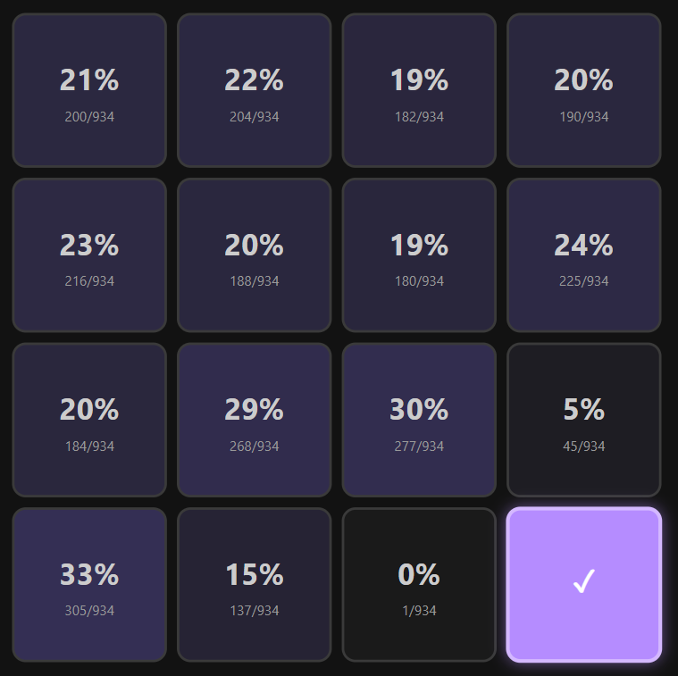
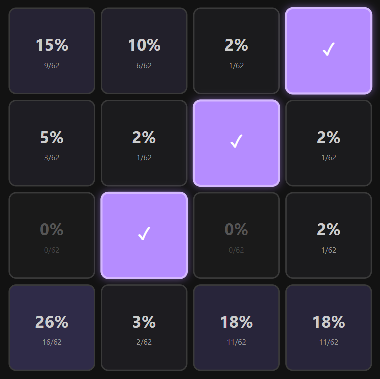
Essentially, it is a correlation explorer between which cells are often grouped together. By selecting a cell (or multiple cells), each remaining cell will be displayed with its associated chance of being also in the same set as the already selected cells.
This reveals some interesting correlations, such as that the bottom right cell has a 0% chance of being in the same group as the cell immediately to its left (R4C3), and only a 5% chance of being connected to the cell immediately above it (R3C4).
Almost every cell experiences a similar effect, albeit to a lesser extent, where they have an inverse + pattern of correlation — the immediately orthogonal cells are usually connected less than 10% of the time.
Some other fun facts:
If you have 3 on a diagonal, the 4th is more likely than almost any other cell
There have only ever been 3 straight rows — ironically enough, all in the first two rows
The four centre cells have never been grouped together
It's just a fun little widget to toy around in — go have a play with it!
This presents a similar view to what you would get in the first heatmap graph if you hid all but one rarity, except it displays it as a topographical map, split by rarity.
Honestly, it doesn't really impart any new insights, but it's a bit of fun. I recommend selecting a smaller date range and scrubbing across the date picker (hover over the above for a preview). One thing I did pick up from this is that Yellow's tendency to prefer the lower rows didn't really emerge for the first 6 months of puzzles — like a child, the style of arranging the puzzles took time to find its feet.
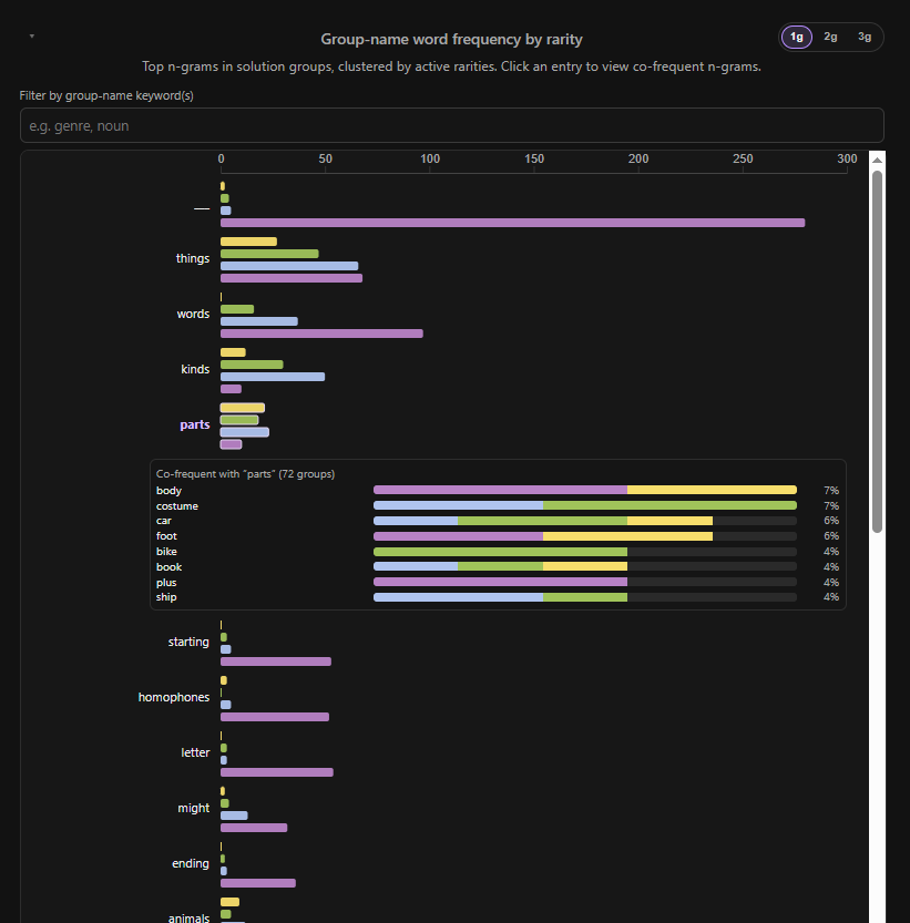
I intentionally leant away from doing too much word analysis (there's plenty of that out there already), but I'd been itching to see the results of this myself, so it snuck in anyway.
(Unsurprisingly) the most common word (or 1-gram) is the triple-underscore '___' used in many of the purple groups to indicate a blank space to fill with the constituent words — and it's not even close. What did surprise me was the use of it in other puzzle groups. Very rarely you see it in the blue group, but turns out it's used not much less often by green, and even yellow has had two uses of this hint. Homophones (another typical Purple hint) and other letter/word-play phrases have similar profiles.
Interestingly, there's not too much correlation between the other sets and the words they most commonly use. parts and kinds are typically not Purple clues, but all you can really say is that the latter isn't Yellow either.
The first category Yellow starts to use more than others do is animals (incl. dogs), but even that is not a significant gap.
movies and characters are a Blue and Purple thing — although more on the Blue side. Same with verbs, which is interesting as that's getting close to Purple's territory.
I added a search to this section so if you're interested in how a specific term is weighted (and which words it's commonly used with!) you aren't restricted to the top words shown by default.
On the 2-gram (two words clustered together) and 3-gram fronts... well, there's not a whole lot of them. The ones that are there are pretty unsurprising and generally either (a) a pretty typical prompt component (e.g. things made), or a recycled prompt (e.g. musical instruments).
One surprising 3-gram I stumbled upon was ___ ___ ___, which is actually stemmed down from the ___ IS ___ (IS ___) prompt. This isn't the only unfortunate victim of stemming, but is perhaps the most laughable.
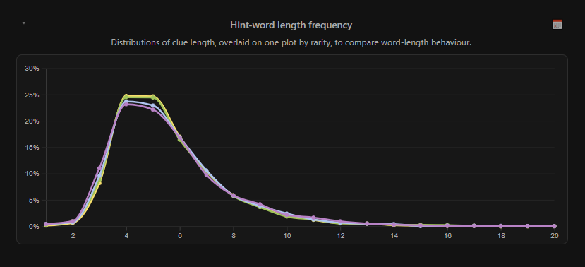
I mainly kept this graph to show that there's little correlation between word length and category. Most words hover in a unimodal distribution peaking around the 4-5 character length, with a long right-skewed tail18.
There's a small (but noticeable) drop in that peak range for the harder difficulties (read: they're ever so slightly more likely to be longer, or very short), but not enough to be significant.
I added a breakdown by day of week, which does have some weird (albeit still low, percentage-wise) differences:
Words trend shorter on Monday, compared to any other day of the week (but the standard deviation is also wider, so that's not very useful)
On Fridays, a 5-letter word is most likely to be blue
On Wednesdays, we don't wear pink purple - in fact, purple is barely interesting, apart from a slight unanticipated blip at the 12-char mark
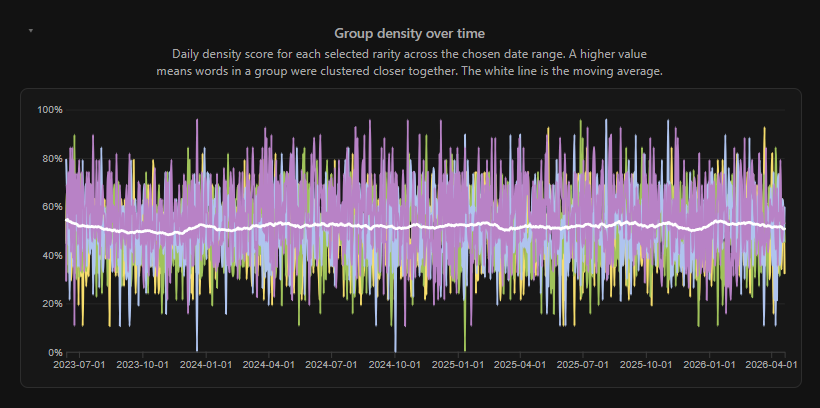
This is a chart showing a calculated density for each group/rarity over time. I include it only because of its mundaneness — it's surprisingly (notably) consistent around the 52% density mark, indicating (as I suggested while looking at the frequently used patterns) that most groups are quite well distributed.
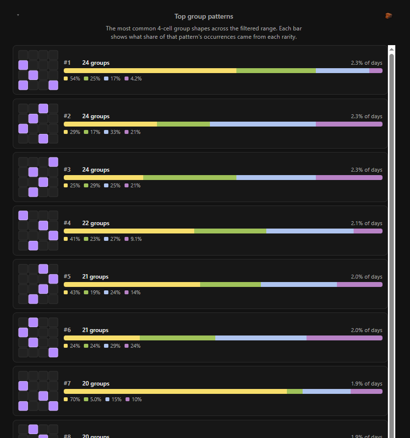
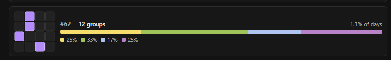
Of course, I had to calculate the most commonly used patterns of cells. To no one's surprise, all the most common ones are very evenly distributed, with the given cells spaced evenly and far apart. They frequently include diagonal connections, so as to not be too suspicious (I imagine), and for practicality's sake (all 4 groups couldn't be equidistantly spaced while maintaining the illusion of randomness). Diagonals are quite common, in fact, but orthogonal connections? Not so at all. In fact, it's not until the 62nd most common group that we see the first orthogonally adjacent pair:
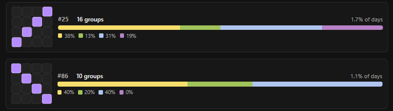
The two diagonal sets, while not uber-uncommon, are ordered (again) in such a way indicating that thought is put into not being too obvious — avoid the top-left to bottom-right natural reading order — with a difference of 25th to 86th most frequent.
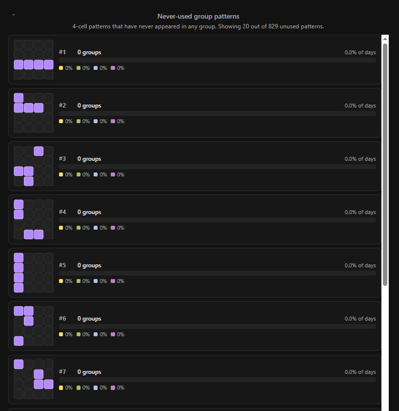
By my calculations, there are 1,820 possible groups possible on the 4×4 grid. Of these, 991 have been used at least once, leaving 829 possible group arrangements unutilised.
Shockingly(!), most of the unused combinations are highly correlated and extremely unlikely to ever see the light of day in a Connections puzzle:
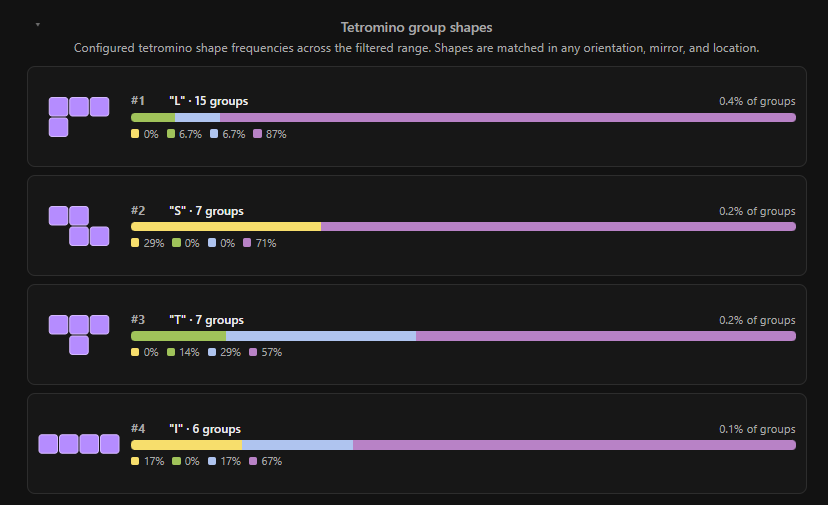
If we take the above graph, and restrict it to only a few specific shapes, what shapes would we choose? Tetrominoes19, obviously! (Unfortunately the grid is too small to match space invaders...)
Tetrominoes are compositions of four orthogonally connected squares, most famous for their titular role in Tetris (the game, not the 2023 film (obviously), although I thoroughly recommend reading up on the story that it was based on)
Keen readers, and/or fans of now-vintage video game lore, will note that there is actually a fifth tetromino missing here! The "O" (or square) tetromino is actually checked for by the page, but as it turns out, there has never been an instance where all four words from a group have been clustered together that way. I guess that's just a hard line for the NYT!
Here I am grouping all reflections and rotations of the glyphs together (sorry fans of the S/Z and L/J splits)
Interesting that purple dominates these, when it accounts for such a small proportion of the overall top patterns! Almost feels like a wink and a nudge...
That said, together they still account for less than 1% of groups, so don't expect to be seeing too many of these out in the wild.
I'm actually pretty happy with the state of this, and don't feel like I'm likely to come back and keep expanding it. That said, if you have some ideas that just HAVE to be explored, the repo is there for forking (or email me20)
If this were more than a toy site, I might spend more time trying to reduce the garbage collection pressure that scrubbing through the timeline (or playing it!) creates — it really loves to eat memory — but it is what it is for now.
I could also imagine doing some analysis on how patterns change and behave as the solve proceeds for each puzzle — the entire premise of this is based on looking at the starting positions, but those go out the window as soon as the first group is solved (and let's just pretend the shuffle button doesn't exist at all). I don't know what this would look like, and I don't have any good ideas for whether there would be anything meaningful you could draw from that, but it's probably possible!
I am, of course, not the first to look at Connections and see a trove of data, waiting to be analysed.
Most of these are more focused on the puzzles' contents themselves than how they are presented (which is what I have focused on here), which is absolutely a reasonable thing to have done — but also why I went and created this analysis!
Here are some of my favourites:
Word Raiders's NYT Connections Statistics
They trawled the publicly shared results from the daily reddit threads, and oh boy, did they get a bunch of metrics out of it! This is most interesting to me because it contains data about the players, more than just about the puzzles.
lechmazure's extended LLM benchmarks
Extensive is indeed an accurate word to use here. Lech has done an extremely thorough job of running various models through their paces and seeing how they do on solving Connections. Based on a naïve reading, it seems like they started getting good around the release of o1 in late 2024.
NYTC's 1st year's hardest puzzles
An official post from NYT, including official solve stats! This is pretty neat, sadly they don't seem to have continued in the tradition post-2024.
Jeremy B. Merrill's "How well can an algorithm solve the NYT Connections game?"
Jeremy attempts to solve the puzzles using a 'coherence' algorithm. It doesn't do very well, but it's still a neat approach! Naturally the LLM chatbot results at the end were quickly outmoded by newer models, as can be seen in the lechmazur benchmarks.
Tristrum Tuttle's "Analyzing 100+ Games of NYT Connections"
They tracked stats about a bunch of their own plays, and then generated some analytics from that, including possibly the craziest Sankey diagram I've ever seen.
There is nothing groundbreaking about this application, but I had a bit of fun making it and playing around with the visualisations, and feel like it validated some of my hunches. I highly recommend you go over and:
I would like to think that if you are reading this, then we have something in common enough to be able to say 'us', even if it's as simple as thinking that coloured graphs are a good time. ↩
Celia has recently branched this out from its original setting of Yliad into typesetting The Importance of Being Earnest, which has been a great lark thus far, and I highly recommend playing both volumes. ↩
I liked it before it was cool (i.e. it was bought up by The Atlantic) ↩
I did not like Wordle before it was cool, ergo I cannot bring myself to play it now that it is Too Mainstream. The closest I have gotten is dabbling with Duotrigordle, which is dumb enough to get away with it (and I love it for that). ↩
For many reasons that Raph puts far more eloquently than I could. I agree with most of his points, but my biggest issue with Connections is that its puzzle designer(s? does Wyna Liu write all of them, or does she let others write some of them?) seems to take a perverse joy in penning specifically USA-centric groups that the rest of the world would have little hope of deducing. ↩
some recent examples:
Let Sleeping Dogs Lie — where the words are just the 4 words from the phrase. Possibly my least favourite type of group because it's such a cop out.
Snack Brands Plus Starting Letter — letter additions are fine, but the brands were mostly all USA-specific brands... and, well, I've already commented on my thoughts on that.
Well, by the puzzle IDs associated with each puzzle, at the time of drafting, there was. By the time it published, there were a handful more, but there are ~79 puzzles IDs not represented in the date-based dataset. Secret puzzles? Maybe! ↩
I'm sure I already had one from a younger life when I was looking at going into data science... perhaps I would have better job prospects if I had. ↩
There are absolutely situations where Node and its associated hellish ecosystem make sense (such as when a business is optimising for available talent pool or speed to market), but this is not one of them. ↩
In full disclosure, I did use LLMs for the production of much of the code in this solution21, but here I am talking about "the control flow was composed specifically for this application's needs" vs "I'm using 5 levels of libraries and I don't actually know what the call stack is at any given point in the code". ↩
Unfortunately this actually means "~1GB of storage later". The GHA runner is very bloated, and has no manners when it comes to cleaning up after itself and leaves a bunch of cruft behind when it auto-updates or executes a run, which (as far as I can tell) can't be disabled. This would be fine on my main workstation, but my VPS has a limited storage allowance (and there are vanishingly few reasonably priced options for VPS' in Australia, and the ones that do exist appear to have capacity shortages currently, presumably due to the ongoing AI datacentre bubble). ↩
As far as I can tell, tutorials are now all on youtube, and everything in the (surfaceable) ocean of text on the web consists of nothing more than LLM-generated slop and/or click-spam blog-farms. Goodness help you if you want to find any information via search, or be able to consume it in a non-linear fashion, or at variable-speed/skim. ↩
The objections here are only marginally relevant to my case (there is almost no context in the first place), but it's preferable to maintain habits in all cases. ↩
Technically the wordplays are often easier — you find the words that make no sense, and tug them apart until you crack the clue. This is a fun way to play, and leads towards the meta-gaming strategy of aiming for the reverse rainbow. ↩
Most 'words' sit firmly in the 2-12 character range, and in fact, the longest actual word is RUMPELSTILTSKIN (15 chars). However, this graph actually measures the total length of the card, not just the word, so the longest phrase is actually SMILING FACE WITH SUNGLASSES (verbatim, not the actual emoji — 28 chars) ↩
I discovered while writing this that the trademarked term for these is actually 'tetrimino', not 'tetromino', as is the standard spelling. I guess they don't always get it right ↩
As much as I would like to have written it all by hand, for my own enjoyment as much as for the knowledge that it's well built, the practicalities of life mean that if I hadn't, it's unlikely I ever would have gotten this project beyond the first graph. ↩